AI YouTube Thumbnail Generator for Finance Channels
Stop guessing. Start creating. Instantly generate 3 complete thumbnail blueprints for your finance videos, aligned with your brand.
AI Thumbnail Generator
Enter your video details and brand guidelines to generate 3 free thumbnail concepts
Next steps
Ready to dominate YouTube for your financial brand?
Twelve specialized services. Pick one — or talk to a strategist about the full engine.
Schedule Strategy CallHow this thumbnail generator works
This explains what the generator does with your details and how mockups are made. The step-by-step walkthrough is further down.
What you enter
Your video topic (at least 20 characters) and on-camera appearance (at least 10 characters) are required. Primary keyword, target audience and brand guidelines are optional. List colors, a font and a style, and describe yourself precisely so all three concepts show the same person.
What happens next
An Anthropic Claude model, prompted with our finance thumbnail templates, returns three concepts: benefit-driven, curiosity-driven and urgency-driven. Each has a headline of four words or fewer plus layout, colors and visual elements, planned for 1280x720 and readable on a phone. The concepts appear on the page. Select the ones you like and an image generation model turns each into a mockup, delivered by email.
Limits
The templates reflect the finance thumbnail patterns we use in client work. Mockups are AI previews: their text can be misspelled, and the emailed image links expire after an hour, so save the ones you want. Build the final thumbnail with your own photo and check any number or promise in the headline. No output is investment advice.
Why Thumbnails Make or Break Your Finance Channel
Your YouTube thumbnail is the single most important factor in a viewer's decision to click on your video. Alongside the title, it forms a powerful one-two punch that can either capture attention or be completely ignored. For finance channels, the stakes are even higher; a thumbnail must not only be eye-catching but also convey professionalism and trust.
A high-performing thumbnail can increase your click-through rate (CTR) by 2-3x, signaling to the YouTube algorithm that your content is valuable and deserves wider promotion. This leads to more views, more subscribers, and ultimately, more clients for your business. Neglecting your thumbnails is like writing a brilliant book with a boring cover—the valuable content inside will never get the attention it deserves.
How Our AI Thumbnail Concept Generator Works
Our tool goes beyond generic text suggestions. It acts as your personal AI art director, generating three complete thumbnail blueprints tailored to your finance content. The process is simple:
Input Your Details
Provide your video topic, primary keyword, target audience, your appearance, and brand guidelines (colors, fonts, style).
Generate Concepts
Our AI analyzes your inputs and generates three unique, detailed thumbnail concepts.
Receive Free Blueprints
You instantly get three professional concepts you can recreate in Canva or your preferred design tool.
Get AI Mockups (Optional)
For a visual preview, select your favorite concepts and provide your email to receive high-fidelity, AI-generated mockups sent directly to your inbox.
The Psychology of Clickable Finance Thumbnails
A great thumbnail works by triggering a psychological response in under 0.3 seconds. For finance, this means balancing three key elements: curiosity, benefit, and credibility. Your thumbnail should make viewers curious enough to click, clearly signal the benefit they'll receive, and look professional enough to be trustworthy.
This is achieved through a combination of high-contrast colors (like blues and yellows for trust and optimism), clear visual hierarchy that guides the eye, and the use of human faces to build an instant connection. Our AI understands these principles, generating concepts that are not just visually appealing but psychologically optimized for the finance niche.
Research shows that thumbnails with human faces increase CTR by an average of 35-50%.
Finance Thumbnail Best Practices: What Actually Works
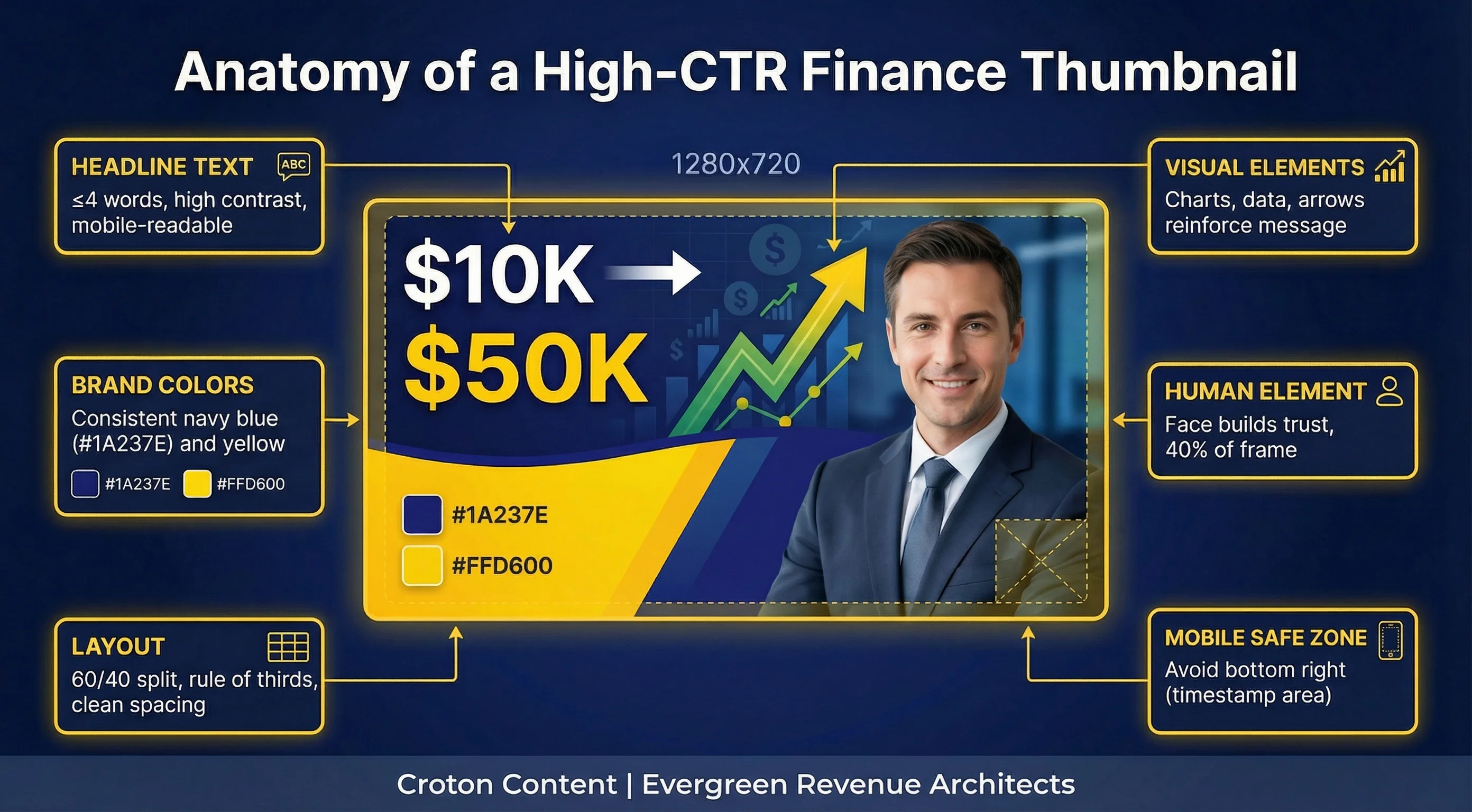
According to YouTube's official guidance, thumbnails with clear text and high contrast consistently outperform complex designs. Based on analysis of thousands of high-performing finance videos, a clear pattern of best practices emerges:
Text is King (and Queen)
Keep text to 4 words or less. It must be large, bold, and instantly readable on a mobile screen.
Contrast is Your Best Friend
Use high-contrast color combinations like yellow on dark blue or white on green to make your text pop.
Show, Don't Just Tell
Incorporate visual elements like charts, graphs, stock logos, or arrows to reinforce your message.
Brand for Recognition
Use a consistent color palette, font, and layout across your videos so viewers instantly recognize your content in their feed.
Stay Compliant
Avoid overly sensational or misleading imagery that could violate financial promotion regulations.
Let us handle your content creation with our Video Marketing Services
Finance YouTube Thumbnail Ideas and Examples by Niche
These concept cards are written for finance creators who want a starting point before they open a design tool. Each card gives a working video title, a layout sketch, the words on the thumbnail, a color direction, the emotion it aims for and why it earns the click. The sketches show placement only, so swap in your own face, brand colors and props. The generator above turns your own video topic into three concepts in this same format.
Personal Finance
I Tracked Every Dollar for 90 Days
- Layout: Face left, text right, a long paper receipt as the prop.
- Text on thumbnail: 90 DAYS LATER
- Color direction: White background, dark green text, gold underline accent. Dark text on a light field keeps the words sharp at phone size.
- Emotional cue: Curiosity
- Why it works: The eye reads the face first, then the time frame, which sets the video up as a personal experiment. It plants the question of what changed after 90 days, and only the video answers it.
The Budget Mistake Costing You Every Month
- Layout: Prop close-up of a bank statement with one line circled, text top left, no face.
- Text on thumbnail: THIS ONE LINE
- Color direction: Black background, yellow text, red circle accent. Yellow on black is the highest-contrast pairing in the feed.
- Emotional cue: Urgency
- Why it works: The red circle pulls the eye to one line on the statement before the text is read. It plants a worry the viewer can only settle by checking their own statement against the video.
Investing & Stock Market
How I Would Invest My First $1,000 Today
- Layout: Face right, text left, a simple rising line chart behind the text.
- Text on thumbnail: FIRST $1,000
- Color direction: Navy background, white text, gold chart line. White on navy reads as calm and credible.
- Emotional cue: Reassurance
- Why it works: The dollar figure is read first because it matches the amount many beginners actually have. It plants the question of where that first deposit should go, which is the promise of the video.
Index Funds vs Stock Picking: 10 Years of Data
- Layout: Split screen, index fund label on the left, stock tickers on the right, text across the top.
- Text on thumbnail: WHICH WON?
- Color direction: Green left half, navy right half, white text across both. White stays readable on both colors.
- Emotional cue: Contrast
- Why it works: The split tells the viewer this is a head-to-head comparison before any word is read. The question in the text asks them to pick a side, and the video settles it with data.
Trading (day, options, forex)
What My First Year of Options Trading Taught Me
- Layout: Face left with a serious expression, text right, a trading screen blurred behind.
- Text on thumbnail: YEAR ONE LESSONS
- Color direction: Charcoal background, white text, red accent bar under one word. White on charcoal keeps the tone sober.
- Emotional cue: Curiosity
- Why it works: A serious face signals honesty about mistakes rather than a highlight reel. It plants the question of what went wrong in year one, which new traders want to know before they start.
The Risk Rule Most Day Traders Ignore
- Layout: Prop: a candlestick chart with the stop-loss line highlighted, text top right, no face.
- Text on thumbnail: THE RISK RULE
- Color direction: Black background, yellow text, red stop-loss line. Yellow on black carries the warning tone.
- Emotional cue: Urgency
- Why it works: The highlighted stop-loss line is the first thing the eye finds on the chart. It plants the question of which rule the viewer might be breaking, and the video names it.
Crypto
Crypto Wallet Security Mistakes to Avoid
- Layout: Face right, text left, a hardware wallet with a padlock icon as the prop.
- Text on thumbnail: STOP DOING THIS
- Color direction: Black background, white text, red accent on the padlock. White on black keeps the warning plain.
- Emotional cue: Urgency
- Why it works: The padlock and the command in the text read together as a security warning. It plants the fear that the viewer is already making the mistake, which the video names.
Bitcoin Explained for Complete Beginners
- Layout: Face left, text right, a simple whiteboard sketch of a chain of blocks behind.
- Text on thumbnail: BITCOIN, SIMPLY
- Color direction: Light grey background, navy text, orange accent on the blocks. Navy on light grey reads as a calm lesson.
- Emotional cue: Reassurance
- Why it works: The whiteboard tells the viewer this is a lesson before the text is read. It answers the beginner's worry that crypto is too complex for them, and promises a plain explanation.
Real Estate Investing
Rent vs Buy: The Real Math for 2026
- Layout: Split screen, apartment keys on the left, a house on the right, text across the top.
- Text on thumbnail: RENT OR BUY?
- Color direction: White background, navy text, green accent on the house side. Navy on white keeps the numbers-first tone.
- Emotional cue: Contrast
- Why it works: The two objects set up the choice before the question is read. It plants the decision the viewer is already weighing and promises the math behind it.
I Analyzed My First Rental Property Deal
- Layout: Face left, a property photo right with a short checklist overlay.
- Text on thumbnail: DEAL OR DUD?
- Color direction: Navy background, white text, gold check marks. White on navy with gold accents reads as considered analysis.
- Emotional cue: Curiosity
- Why it works: The checklist tells the viewer a verdict is coming. It plants the question of whether the deal passed, and the rhyme in the text makes it easy to remember in the feed.
Financial Advisors & Wealth Management
When Should You Hire a Financial Advisor?
- Layout: Face left, the advisor seated in an office, text right.
- Text on thumbnail: NEED AN ADVISOR?
- Color direction: Cream background, navy text, gold rule under the text. Navy on cream feels calm and established.
- Emotional cue: Reassurance
- Why it works: A composed face in a professional setting reads as trust before the question is read. It invites viewers who are unsure to self-qualify, which suits an advisor channel that wants the right clients.
The Retirement Question Clients Ask Most
- Layout: Face right, text left, a large question mark as the prop.
- Text on thumbnail: ENOUGH TO RETIRE?
- Color direction: Navy background, white text, gold question mark. White on navy keeps a serious topic calm.
- Emotional cue: Curiosity
- Why it works: The question mark and the face share the frame, so the viewer reads it as a conversation. It plants the question every pre-retiree asks, and the video walks through how an advisor answers it.
Banking & Fintech
High-Yield Savings vs Your Big Bank Account
- Layout: Before/after: a grey big-bank app screen on the left, a bright savings app screen on the right.
- Text on thumbnail: SWITCH OR STAY?
- Color direction: White background, grey left side, dark green text and accent on the right. The color shift from grey to green shows the change before any word is read.
- Emotional cue: Contrast
- Why it works: The grey side reads as the status quo and the green side as the better option. It plants the question of whether the viewer's own savings are sitting on the grey side.
Fees Your Bank Charges Without Telling You
- Layout: Face left with a surprised look, text right, a phone showing a fee list as the prop.
- Text on thumbnail: CHECK THIS NOW
- Color direction: Black background, yellow text, red highlights on the fee lines. Yellow on black carries the alert.
- Emotional cue: Urgency
- Why it works: The surprised face and the phone screen read together as a discovery. It plants the question of which fees the viewer is paying, and sends them into the video to check.
Best Colors for Finance Thumbnails
The best colors for a finance YouTube thumbnail do two jobs: they separate the text from the background at phone size, and they set the tone before a word is read. Pick one pairing for your channel and repeat it so viewers recognize your videos in the feed. Save the warning palettes for videos that are genuinely about risk or mistakes, because a channel that is always alarmed stops being believed. Red works best as a single accent on a loss or a fee, never as the whole thumbnail. Advisor and educational channels usually do better with a light background and dark text, which reads as calm and credible next to louder thumbnails.
| Palette | Reads as | Use for |
|---|---|---|
| Navy and gold | Trust, stability, wealth | Investing, wealth management and advisor channels |
| Green and white | Growth, clarity, calm progress | Personal finance, savings and budgeting videos |
| Black and yellow | Warning, attention | Mistakes, scams and what-to-avoid videos |
| Red accents (sparingly) | Loss, urgency | Market drops, fees and risk topics, as one accent only |
| Light background, dark text | Education, calm authority | Advisor, explainer and beginner channels |
How to Use Brand Guidelines for Consistent Thumbnails
Brand consistency is key to building a loyal audience. Our Brand Guidelines input allows you to bake your brand directly into the AI's creative process. Here's how to use it effectively:
Colors
Provide 2-3 of your primary brand colors in hex code (e.g., #1A237E, #FFD600). The AI will use these for backgrounds, text, and accents.
Fonts
Specify your brand font (e.g., Montserrat Bold). The AI will recommend using this font in the concept.
Style
Describe your channel's aesthetic (e.g., clean, professional, minimalist or bold, energetic, high-contrast).
Your Appearance
Required in the form above. Describe yourself so concepts feature you—not a generic stock persona (e.g., 40-year-old Black woman, curly hair, red blazer, warm smile).
Common Thumbnail Mistakes Finance Creators Make
Many finance channels struggle to gain traction due to easily avoidable thumbnail mistakes:
Too Much Text
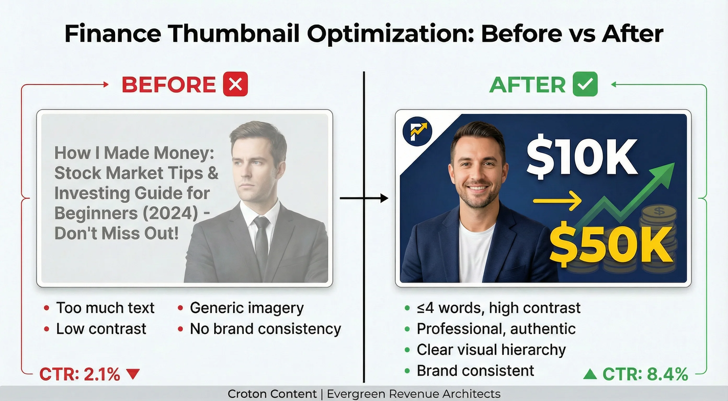
The most common error. If you can't read it in a split second on a tiny mobile screen, it's too much.
Generic Stock Photos
Using the same stock photos as everyone else makes your content look cheap and unoriginal.
Inconsistent Branding
Constantly changing colors, fonts, and layouts confuses your audience and prevents brand recognition.
Ignoring Mobile
Over 70% of YouTube views are on mobile. Design for the smallest screen first.
Low Contrast
Gray text on a white background might look elegant on your desktop, but it's invisible in a crowded feed.
Avoid these mistakes with our Video SEO Services
Industries
Serving Your Financial Vertical
Frequently Asked Questions
Common questions about our YouTube thumbnail concept generator
Is this YouTube thumbnail generator free?
Yes, our AI Thumbnail Concept Generator is 100% free to use. You can generate unlimited thumbnail concepts. The optional AI-generated mockups are also free but require an email to receive them.
What's the difference between a concept and a mockup?
A concept is a detailed text blueprint that tells you exactly how to design your thumbnail—including layout, colors, fonts, and visual elements. A mockup is an AI-generated image that shows you what the final thumbnail will look like.
How do I use the Brand Guidelines field?
Describe your brand's visual identity: primary colors (hex codes), main font, and overall style (e.g., minimalist, bold). Your on-camera appearance is entered separately in the required Appearance field.
What should I include in "My Appearance"?
Be descriptive! Include your age, gender, ethnicity, hair color/style, and typical attire (e.g., 40-year-old Black female, curly hair, red blazer, enthusiastic smile). The more detail you provide, the better the AI can incorporate your persona.
Can I use this for niches other than finance?
Absolutely. While the tool is optimized for finance content, the underlying design principles carry over to other niches. Simply adjust your inputs and brand guidelines accordingly.
What makes a good finance thumbnail?
A good finance thumbnail balances credibility with curiosity. It uses professional design, clear text, and trustworthy imagery to grab attention without looking like clickbait. For worked examples in every finance niche, see the finance thumbnail ideas and examples above.
Should I use the exact concepts generated?
You can, but we recommend using them as a starting point. Feel free to mix and match elements from different concepts or tweak them to perfectly match your video's content and your personal style.
How does AI help with thumbnail creation?
AI can analyze vast amounts of data on what makes thumbnails successful. It helps you brainstorm ideas, apply proven design principles, and create professional-looking concepts in seconds, saving you hours of creative effort.